
Thinking inside the box
When it comes to creativity, artists are often encouraged to approach the task of problem-solving in a unique way that goes beyond the obvious, challenging them to look for solutions from every possible angle in order to gain a different perspective and greater insight into their subject. This approach involves what is often referred to as “thinking outside of the box” and encourages searching for new ways to solve old problems. The results of working this way often far outweigh the time and effort that it took to arrive at the new solution. Although breaking the boundaries of everyday thinking can often lead to new, creative solutions, sometimes the best answer may involve staying within a limited boundary in order to achieve unlimited results.
When working with color, thinking inside the box is often the best solution for achieving the most effective results. I’m not suggesting that an artist should limit the colors that are used in a painting but, instead, limit or restrict the environment in which those colors perform. The first step towards understanding color is to realize that it can only exist when value is present. In other words, color is a component that can be inserted into a value.
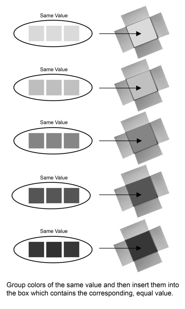
To illustrate this concept, picture a series of boxes, each containing a specific value which registers somewhere between black and white on a value scale. These boxes represent the range of light and dark values that are available to you when painting.
Next, picture a variety of color swatches that need to be placed into those boxes. These color swatches represent the color possibilities that are available to you on your palette, each one having its own, unique identity and registering somewhere on the value scale.
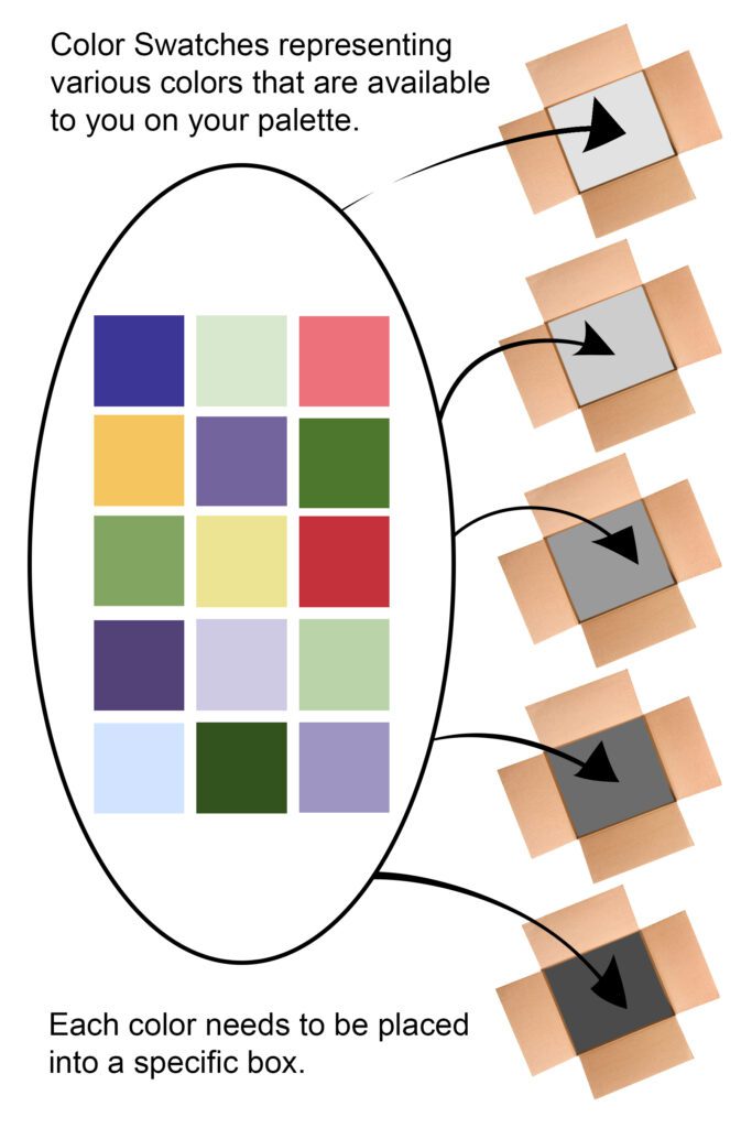
When trying to decide which box to place each color into, there’s only one simple rule: Each color that’s being inserted into a specific box must be of the same value that already exists within that particular box. This means that you can’t just randomly place any of those colors into whichever box that you want to, hoping that it will somehow be correct. Instead, you must first determine how light or dark the value is inside of each box and then find the color swatches that match that same value.
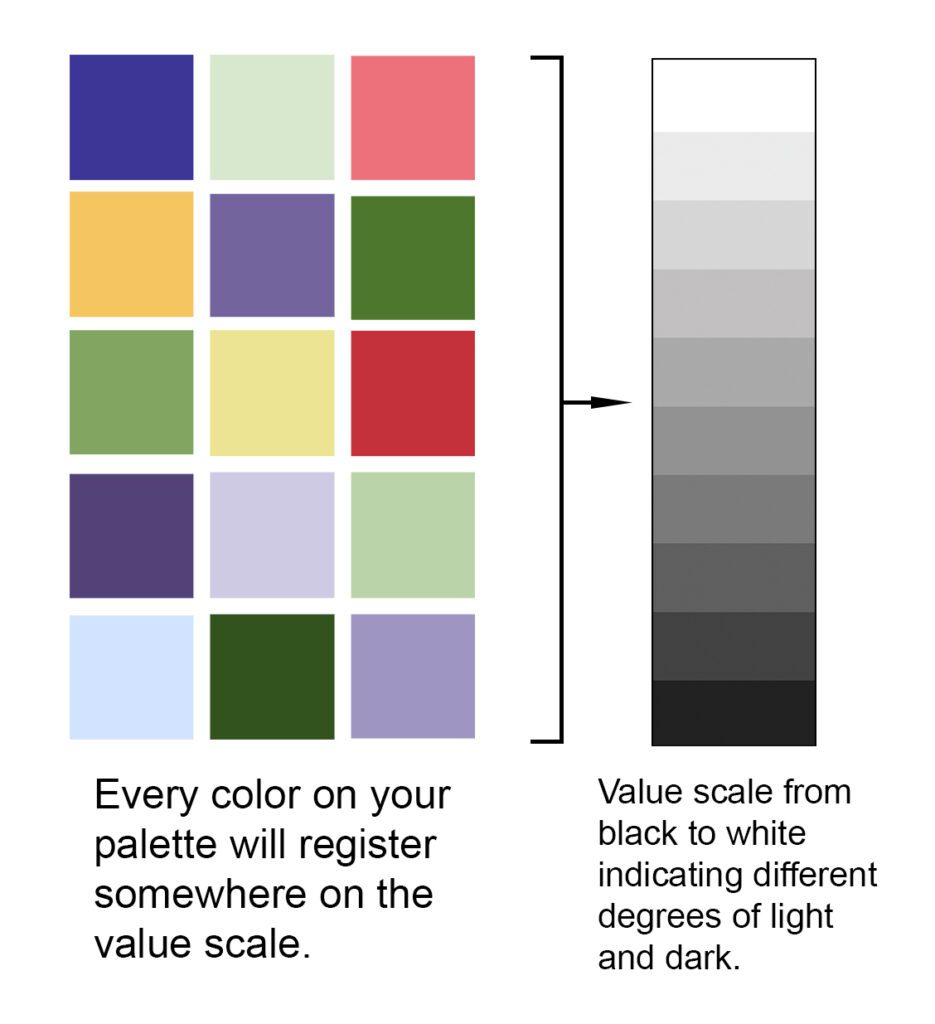
Heres an image of the same colors from the chart above converted to a black and white image to show the value of each color and where it registers on the value scale.
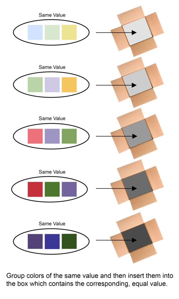
Once you’ve determined the correct value of a specific box, it’s then just a matter of grouping colors of the same value together and placing them in the corresponding box.
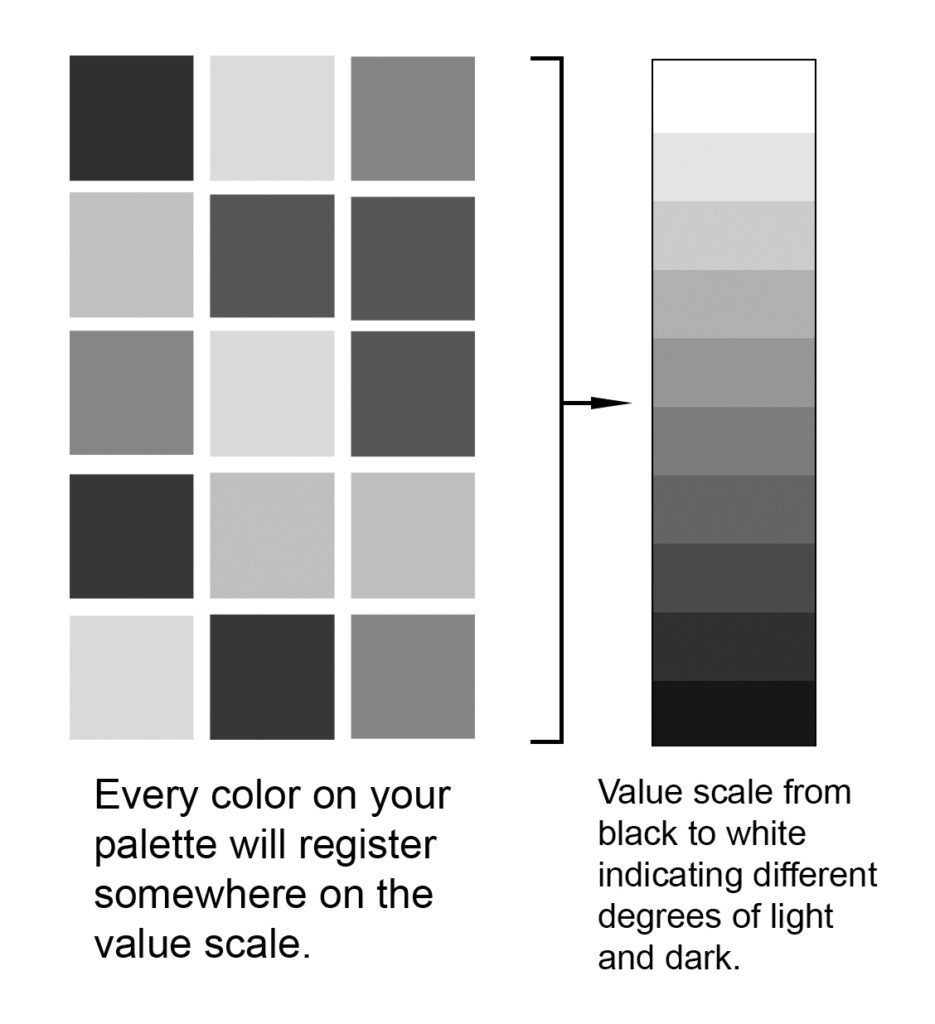
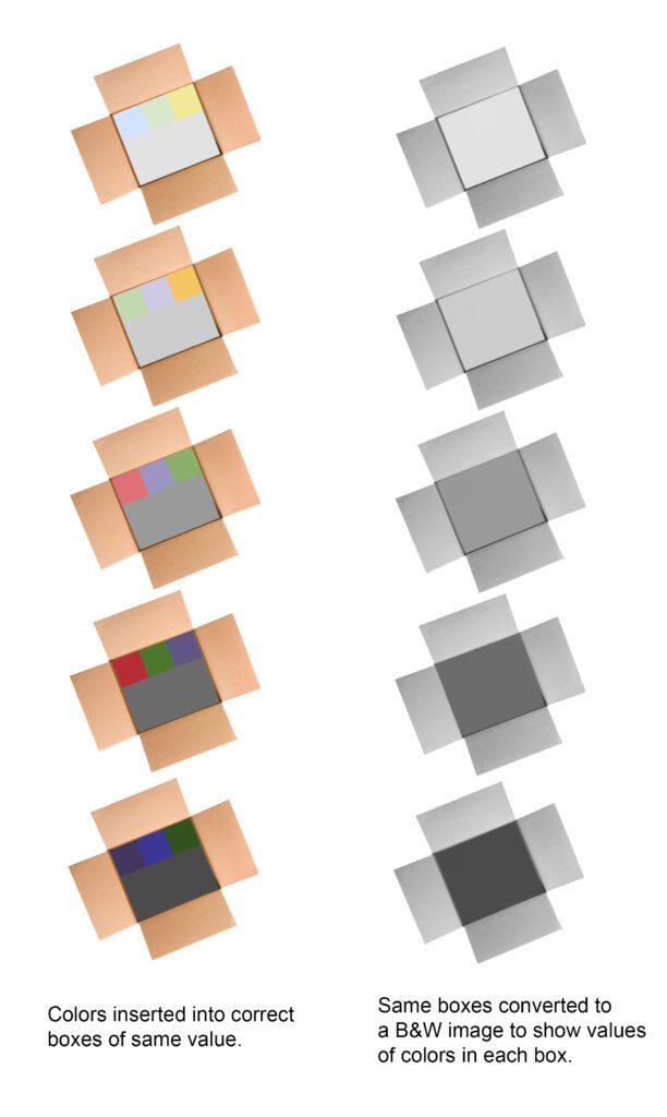
Here’s what it looks like when we convert the illustration above into a black and white image.
If done correctly, all of the inserted color swatches will match the value that is contained within each specific box. Here’s an example of what the colors would look like when placed into the correct boxes. The reason for showing the color and black and white version side by side is to illustrate how color affects our perception of value. When seen in color, some swatches tend to stand out more than others. This can often lead to second-guessing yourself when it comes to having the correct value. For instance, the red colored swatches may tend to look lighter in value when seen in color, but are exactly the same value of the other colors next to it when seen in the black and white version.
Having said all of that, how does this apply to you as a painter? Understanding how color and value work together as a team, the artist is then better equipped to utilize the warm and cool temperature changes that take place within those values. The reason this is so important is because you may find yourself running out of values to use at some point during the painting process, struggling to create more volume (a three dimensional look) in your subject. If you rely solely on value changes in order to create the illusion of form, this scenario may leave you frustrated and uncertain of where to go next. One way of solving this problem might be to use a change in temperature to indicate a change in planes. When I talk about planes, I’m simply referring to a structural change in direction within your subject, usually indicated by a change in value, temperature (warm to cool or cool to warm), or a combination of both. The value and temperature changes that occur on these planes help to visually describe how an object recedes and give a three-dimensional quality to your painting, similar to how our eyes view objects in nature. Recognizing where these plane changes occur is important because they will give you clues as to where to place your warm and cool color changes. Often, a change in plane may also produce a change in temperature and can occur within the same value.
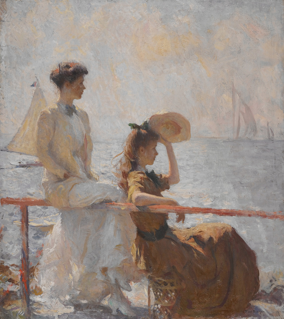
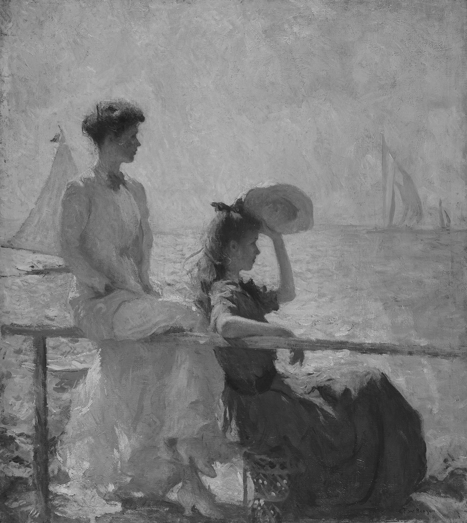
The great American Impressionist, Frank Benson, was a master at simplifying the values that he used within a painting and then inserting warm and cool color changes of the same value within these larger areas. This resulted in large masses that were similar in value, yet rich in color. Where one artist might be tempted to use a change in value (from light to dark or dark to light) to indicate form, Benson would often choose to use colors of the same value, placed where a change in planes would occur, to indicate form within these areas. Here’s a great example of one of Benson’s paintings which illustrates the wide use of warm and cool colors throughout the painting, each confined within a specific “box” of value.
So, the next time you’re wanting to close the lid on a particular problem in color, take a minute and simplify the solution by thinking inside the box of value.