
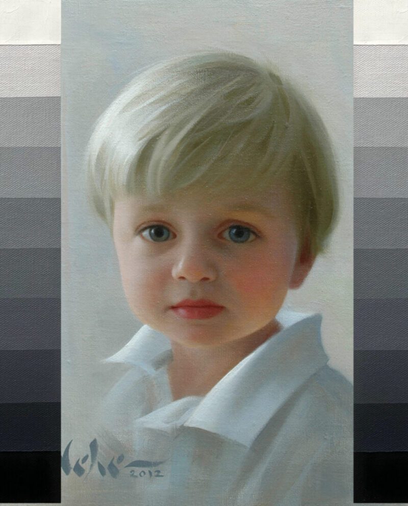
Transposing in Paint
As artists, we are constantly trying to capture the effects of light by using paint. Since we are dealing with pigment, not light, we are given certain boundaries in which to work. One of these boundaries occurs when it comes to the subject of values. We are extremely limited in the number of values that are available to us in paint. We only have from black to white and everything in between. This is clearly seen on a value scale which represents different degrees of light and dark (black representing the darkest value available in paint and white representing the lightest value available in paint.

Because there are so few values with which to work, an artist must be frugal in how he spends them while painting.
Think of it this way: Picture the musical scales on a piano. A musician is able to play any note that is available to him on that scale. He can play an extremely low note, an extremely high note, or any other note in between those two. He can use them in any combination that he chooses, but he must stay within that scale because there are no other musical notes available to him outside of that range.
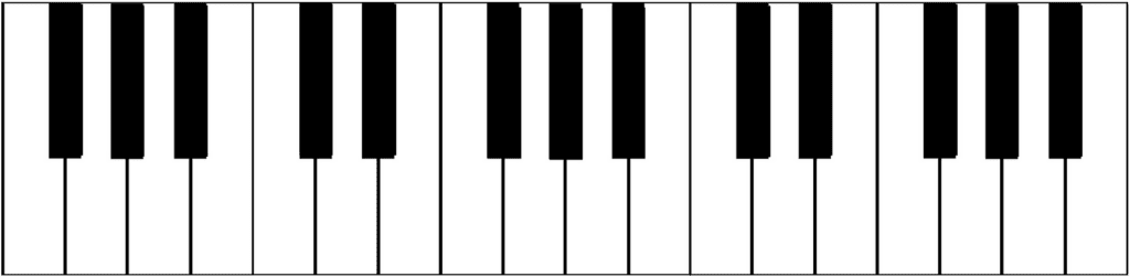
But does he have to use EVERY note on the scale in order to play a song? There are some notes that never get played throughout the course of an entire song, yet the listener is able to hear a beautifully composed arrangement.
The same principle can be applied to values.
Just because you have an entire value scale to work with doesn’t mean that you have to use every one of those values in your painting. What if you only used half of those values, say from black to a middle value?

Or how about a middle value to white?

You might be saying, “Brian, that’s impossible. How can I paint a subject that is dark in value without using dark colors to start out with?”. The answer is found in “value relationships” (how light or dark a value appears when compared to another value).
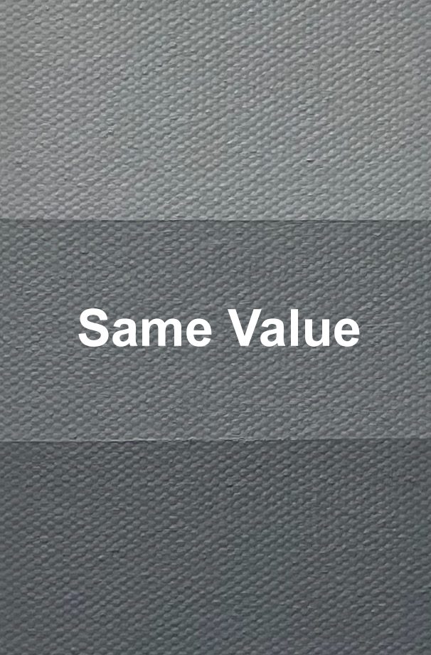
I like to think of it as transposing in paint. Just as a musician is able to play a song in either a lower key or a higher key, the listener still recognizes the song because the note relationships remain intact. In other words, the distance from one note to another remains the same, regardless of what key it is being played in.
A similar situation occurs in art. The value scale can be shifted higher or lower as long as the value relationships remain the same. I can choose to paint a subject in a higher key (lighter value relationships) or a lower key (darker value relationships).
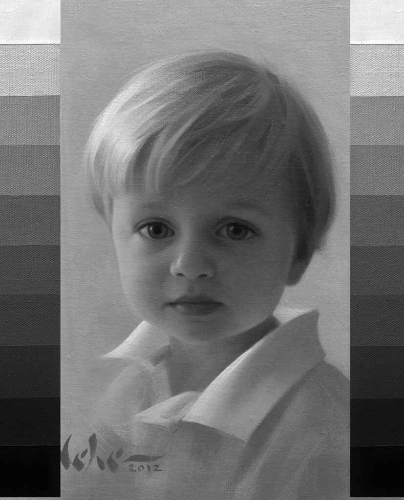
Notice the value relationships in the painting above. Everything is keyed slightly higher in value and the darkest values on the scale are in the boy’s eyes.
I remember watching the great portrait painter, Joe Bowler, work on a portrait of a little girl with very dark, brown hair. In the reference photo, the value of the hair looked almost black, yet Joe painted it about two values lighter. I asked, “Why aren’t you using your darkest value to paint the hair?”. He simply replied, “I don’t need to, as long as the value relationships are correct.” That was my first eye opening experience in how to key a painting higher or lower in value.
Remember, when it comes to painting in a different key, everything relies on value relationships. If one value is off, then the entire painting will look incorrect. Just as in music, if a wrong note is hit during a song, it is difficult for the listener to forget that one note. If one value is incorrect in your painting, the viewer will be drawn to that one area, even if they have no knowledge or understanding of values.