
Painting Playbook
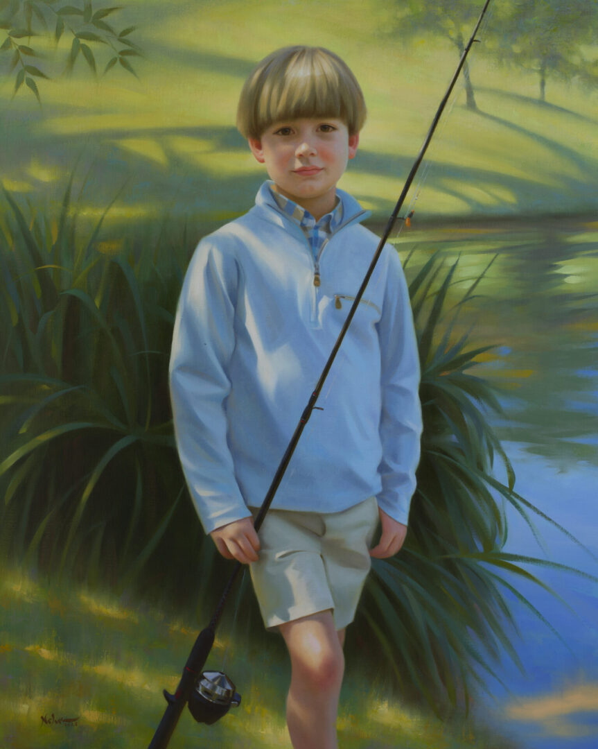
There are several factors that come into play when finishing a painting. While individual elements like drawing, value, color and edges play an important role by themselves, each of these separate parts must work together as a team in order to produce a timeless work of art. Getting everything to work as an entire unit when viewed as a whole involves some strategic planning on the part of the artist. Here are some lessons from my artistic playbook that I’ve used when painting commissioned portraits.
Design and Composition play an important role in painting to help guide the viewer’s eye towards the main focal point. This can be done through the use of lines, values, shapes and colors.
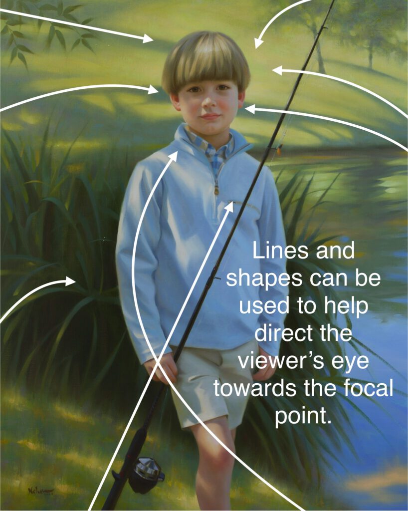
In this painting, the shapes of the shadows in the background direct the viewer’s attention towards the boy’s head, away from the sides and top corners of the canvas. Directional lines from the drawing of the pampas grass lead towards the figure, pushing the viewer’s attention to the center of the canvas.
Correct Value Relationships and Color Temperature can help give the illusion of a particular lighting situation. Correct value relationships (how light or dark a color appears when compared to another color) are vital in order to achieve a three-dimensional look in your subject.
If your values aren’t correct, then your colors won’t be correct either. The reason that I say this is because value is the environment in which color exists. Every color on your palette will register somewhere on a value scale from black to white. To get the correct value relationships, I will use my darkest value as a reference point from which I can judge all other values against. If I know where my darkest value in the painting occurs, then I also know that every other value in the painting cannot be as dark as that reference point.
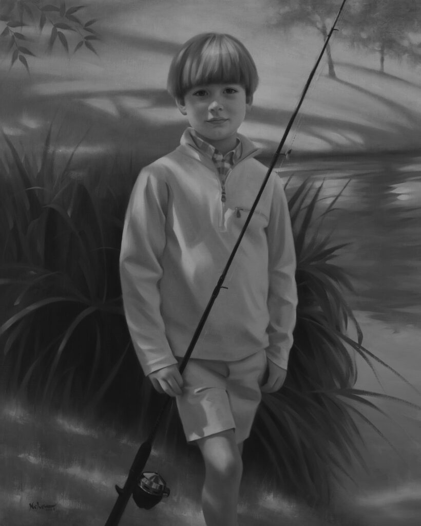
When converting this portrait into a black and white image, all of the color is removed but the value relationships remain. There is still a sense of volume and form to the figure. To help simplify values when looking at my subject, I will half squint my eyes, limiting the amount of light that reaches them. As a result, values are more easily recognized as large shapes and unnecessary details are no longer seen. The information that I’m seeing through squinted eyes is what I’m seeking to capture on canvas.
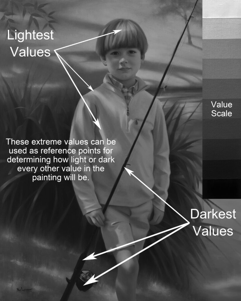
The placement of the lightest values in the boy’s clothing, hands and leg also serve as visual stepping stones, redirecting the eye back towards the lightest values in the head and hair.
The dark value and line of the fishing pole are diagonally placed to stop the viewer’s eye from moving too far to the right of the canvas, leading them back towards the darker values in the eyes
Color Temperature refers to how “warm” or “cool” a color appears when compared to another color. A warm color tends to lean more towards the yellow side of the color wheel while a cool color leans more towards the blue side of the color wheel. Each color family (red, orange, yellow, green, blue, purple) has a warm and cool version of itself. For example, a warm green (sap green) contains more yellow in its mixture than a cool green (viridian) which leans more towards the blue side of the color wheel.
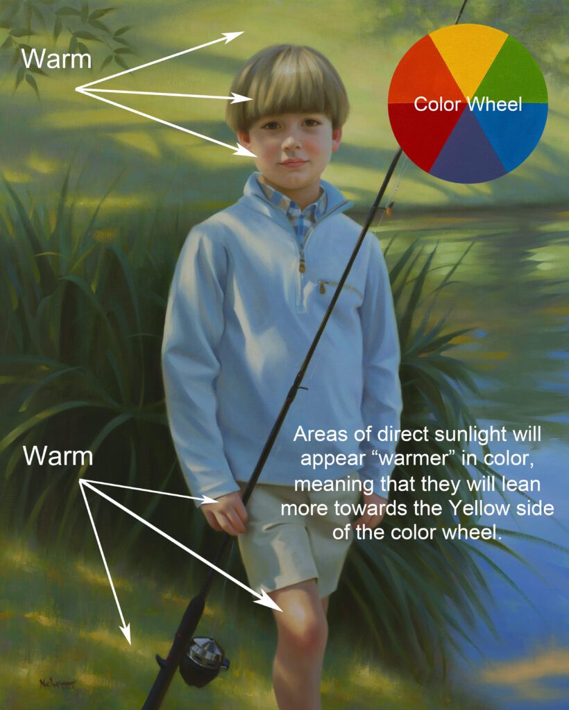
The warm reds found in the flesh tones of the boy’s head, hands and leg are both a contrast and complement to the greens in the background. This difference in color temperature helps to draw further attention and distinction to the figure.
When trying to decide whether a color needs to be warm or cool, I will first determine the temperature of the light source (warm or cool). This is one of the greatest lessons that I learned from renowned portrait painter, Joe Bowler. He said that when it comes to painting, there is a warm side and a cool side to everything. A warm light source tends to produce cooler shadows while a cool light source produces warmer shadows.
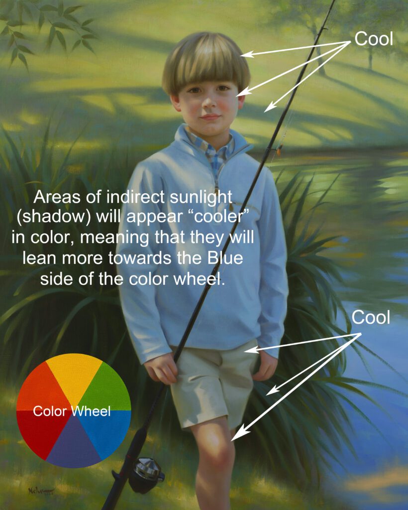
Because of the limited value range that artists must work with in paint, employing correctly placed warm and cool colors within the same value can help to further create the illusion of form. I will often do this by using complementary colors (located 180 degrees across from each other on the color wheel). For example, I’ve used a warmer orange in the reflected light that is bouncing back up into the boy’s blue jacket.
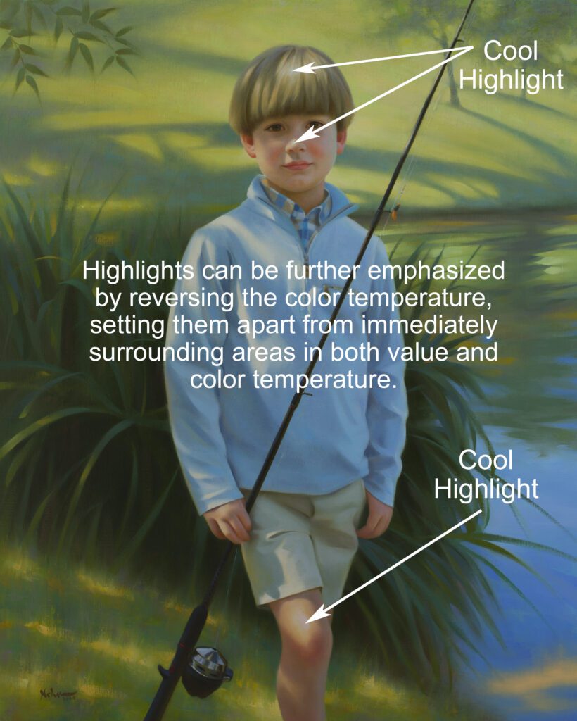
While predictable patterns in light can greatly help when determining where to place warm and cool colors in a painting, there are times when I will do the opposite in order to create a greater emphasis or effect in a painting.
One example would be the extreme highlights in the focal point of my subject. I will often reverse the temperature of the highlight from that of the immediate, surrounding colors. For example, the highlights on the boy’s hair, nose and knee are cooler in temperature than the warmer colors that are surrounding them.
One of the most challenging aspects of painting is getting everything to work together as a whole. Although each team member (drawing, value, color, edges) has a specific strength and skill set, they cannot be equal in importance. There has to be an overall sense of balance and teamwork in order to reach the finish line.